|
The first part of the art criticism process is Describe, here you are supposed to explain the image or piece that you see in no figurative language. Part two is Analyze, in this part you reflect upon the art by using the principles or elements of art. Part three is Interpret, try to understand what the piece of art means or is trying to say and why. Lastly part four is Evaluate, basically determine whether the art piece is successful or important in sending this message.
0 Comments
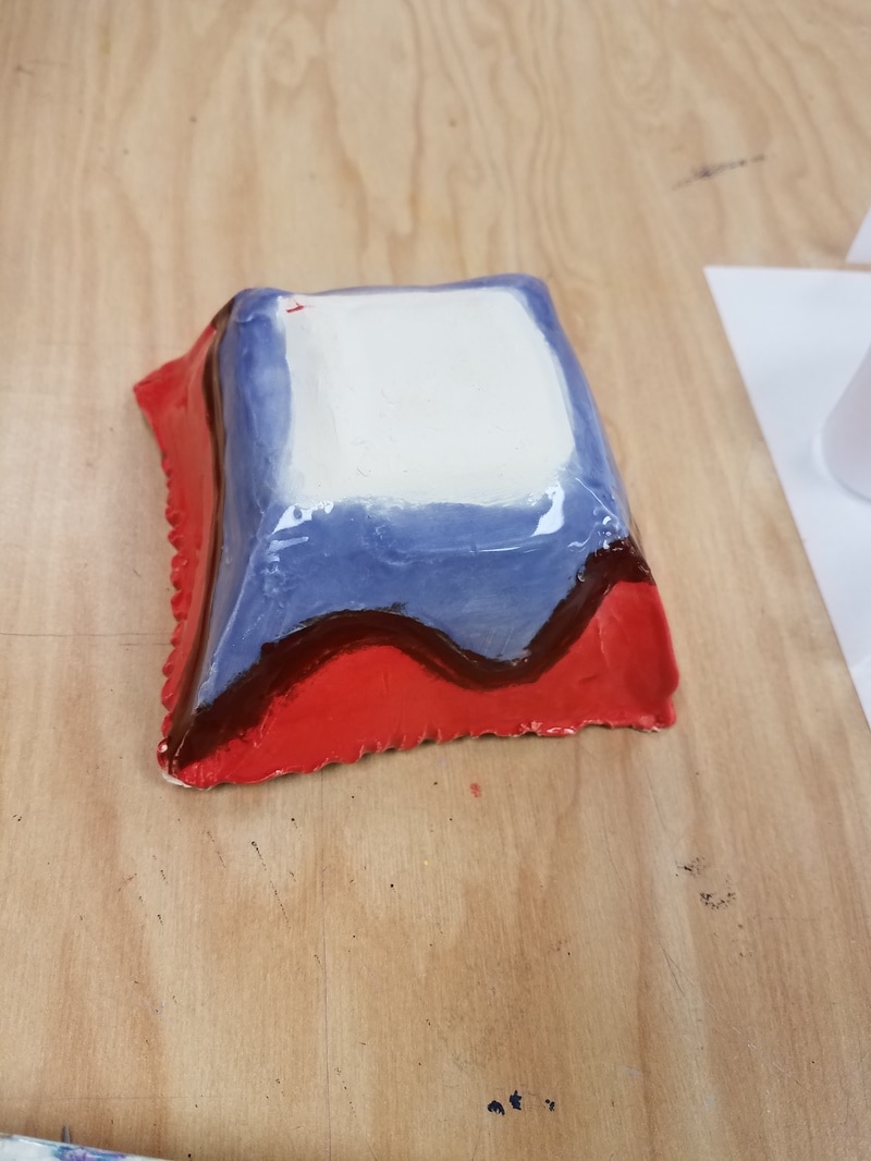
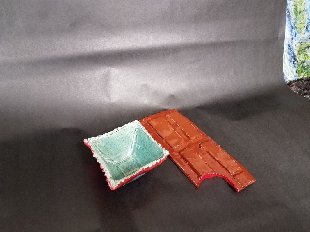
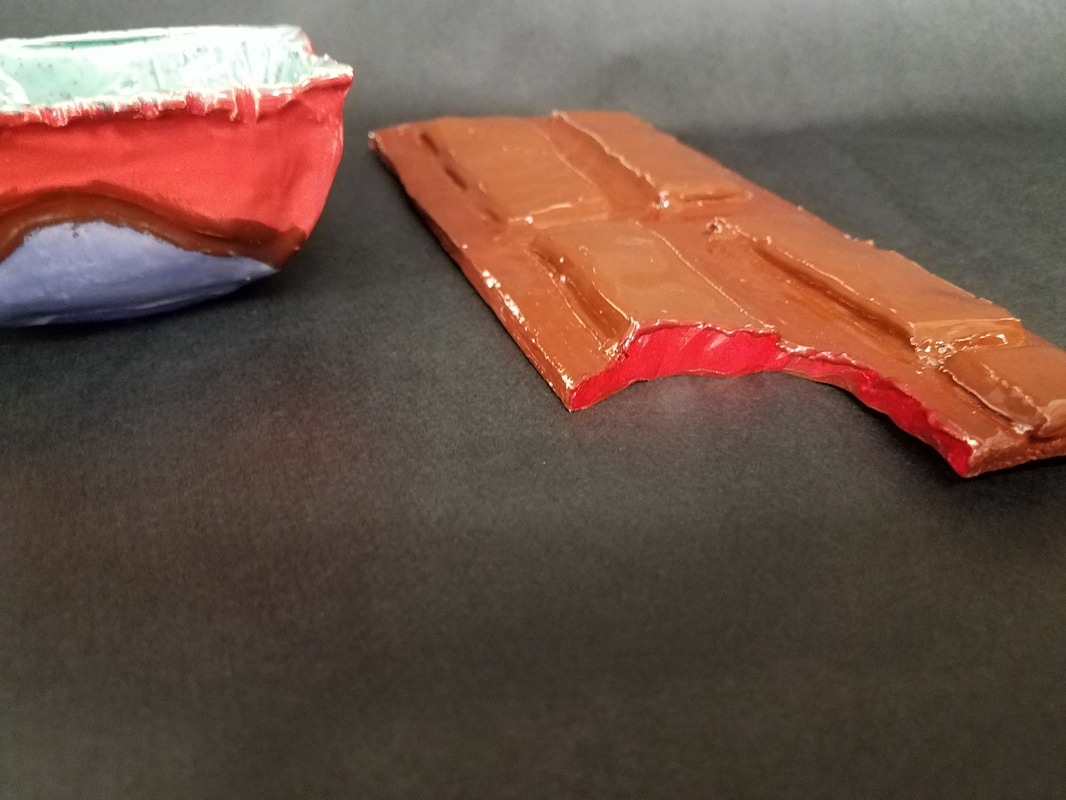
My tray is used for decoration, the bowl though is made with a food safe glaze so you can you it to put candy in. My design makes it fun and makes people think of sweets.
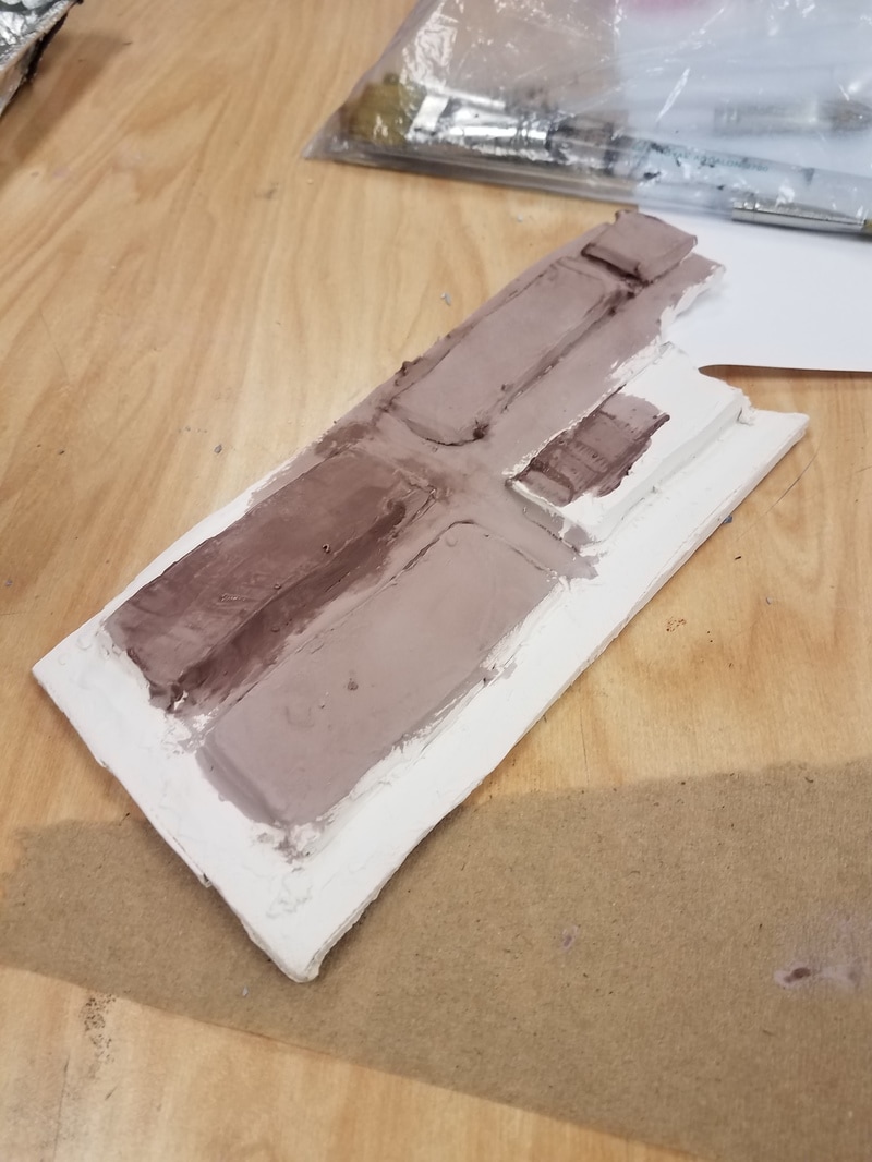
What made me think of this idea is the Hershey bar that was left over after Easter. When you think about it they are pretty big and when I carried it upstairs I carried somethings on top of it, so in a way it worked as a tray for me. So I made the tray first, I started by rolling a slab of clay out and cutting out a rectangle. I then pressed the remains together and rolled them again, this time cutting out smaller rectangles and scratching and slipping them onto the larger rectangle, then I cut out a chunk to make it look like a bite mark. I then fired it, while that was happening I took a bowl and wrapped it in plastic wrap, then put on clay around it. I shaped the clay, waited a day for it to harden, took it off the cup, made designs on the edges and had that fired too. The bowl came back to me first and I glazed it using mint, red, brown, and purple colored glazes. Then it was glaze fired. I paint the bottom with acrylic paint that matched the purple. Then the tray came to me and I glazed it with brown glazes, glaze fired it, then painted the rest with acrylic paint.
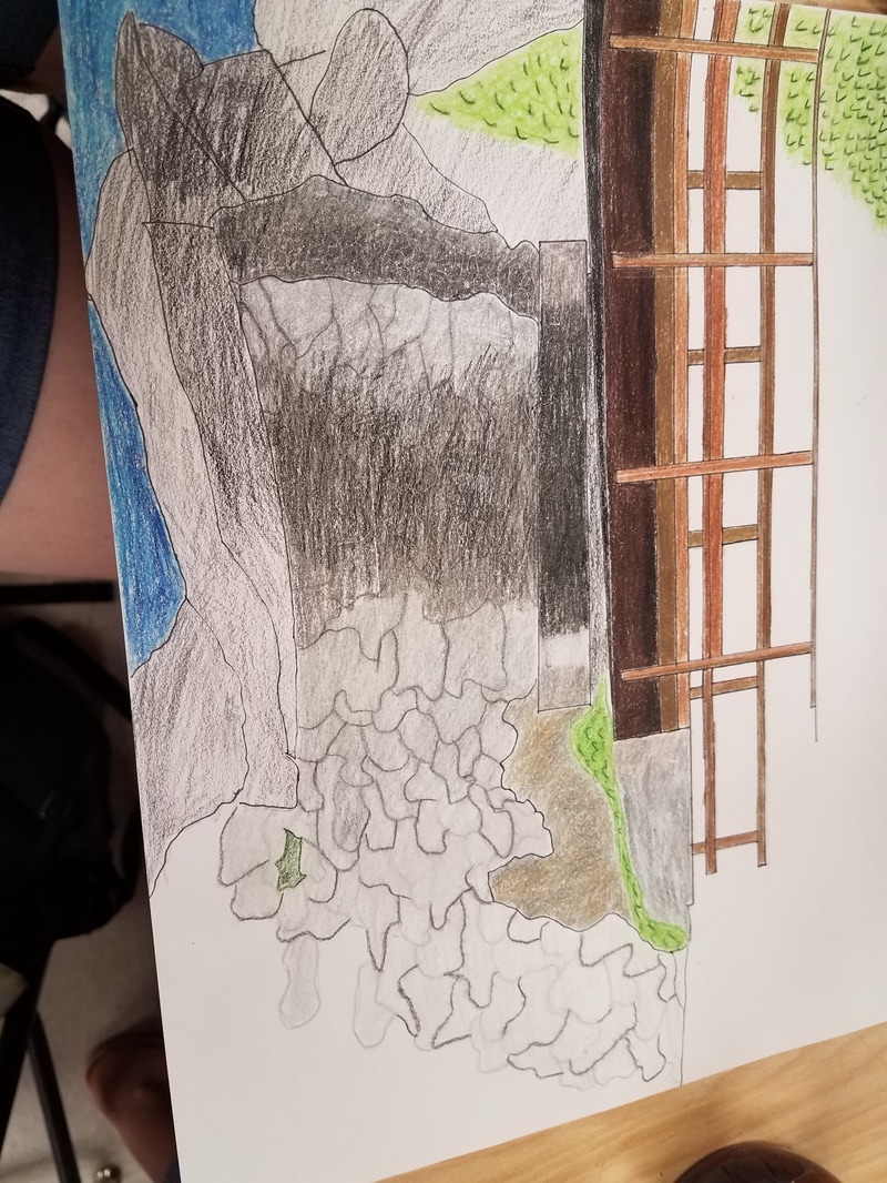
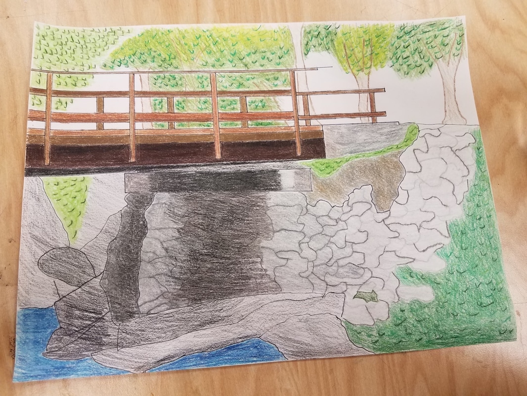
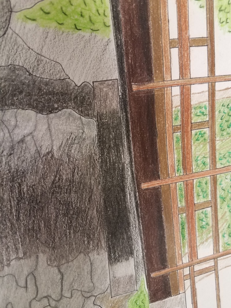
My piece is a 2 point perspective, you can see it in the bridge. My medium was pen and colored pencil, that way I could get finer shading and details. This photo was taken in the mountains, in western NC (sorry I forgot the name). It was a cool bridge that was on the hiking trail we were on. The hard part about the project was the overlap in the bridge, creating perspective. It was hard to see it when I was drawing it and the lines made it a bit confusing when coloring in.
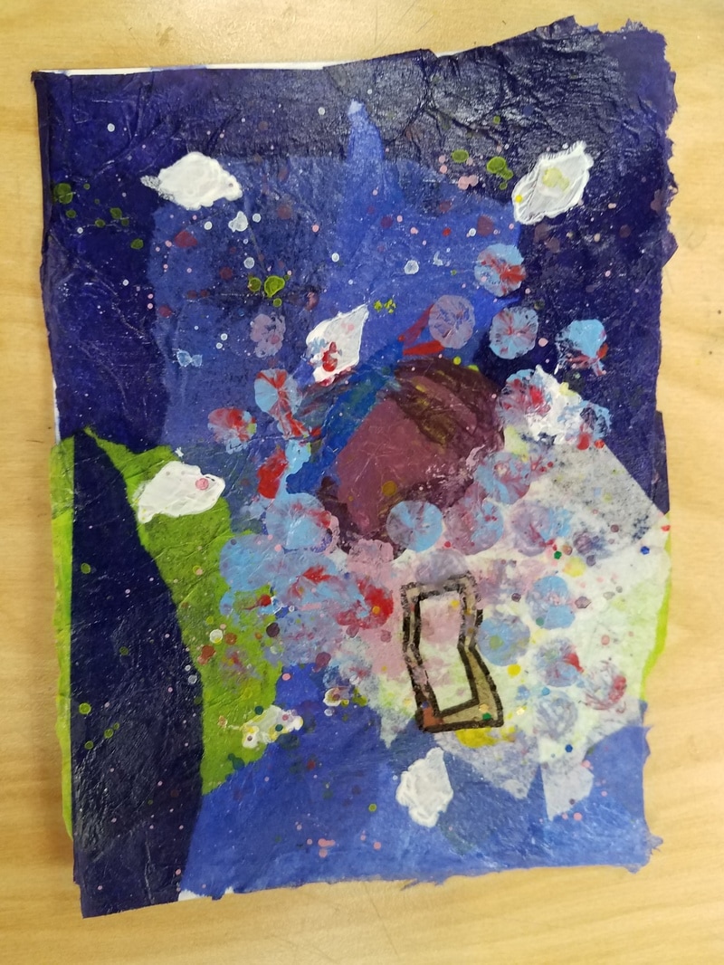
I used 5 layers, the first layer was paper mache, the second layer was diamond stencils I used white paint to contrast the dark background, the third was markers, I used that to draw the book, it had to be clear for people to tell what it was so I felt that marker was the best, then the fourth layer was paint, it was used to make the butterfly, I wanted to make it look like it was coming out of the book, the fifth layer was the bubble wrap. I put blue and red on the bubble wrap so that it would make a sort of tie-dye design and look to it.
My word was believe I portrayed it as an butterfly coming out of a book. It gives the impression that if you believe in something it can come to life.
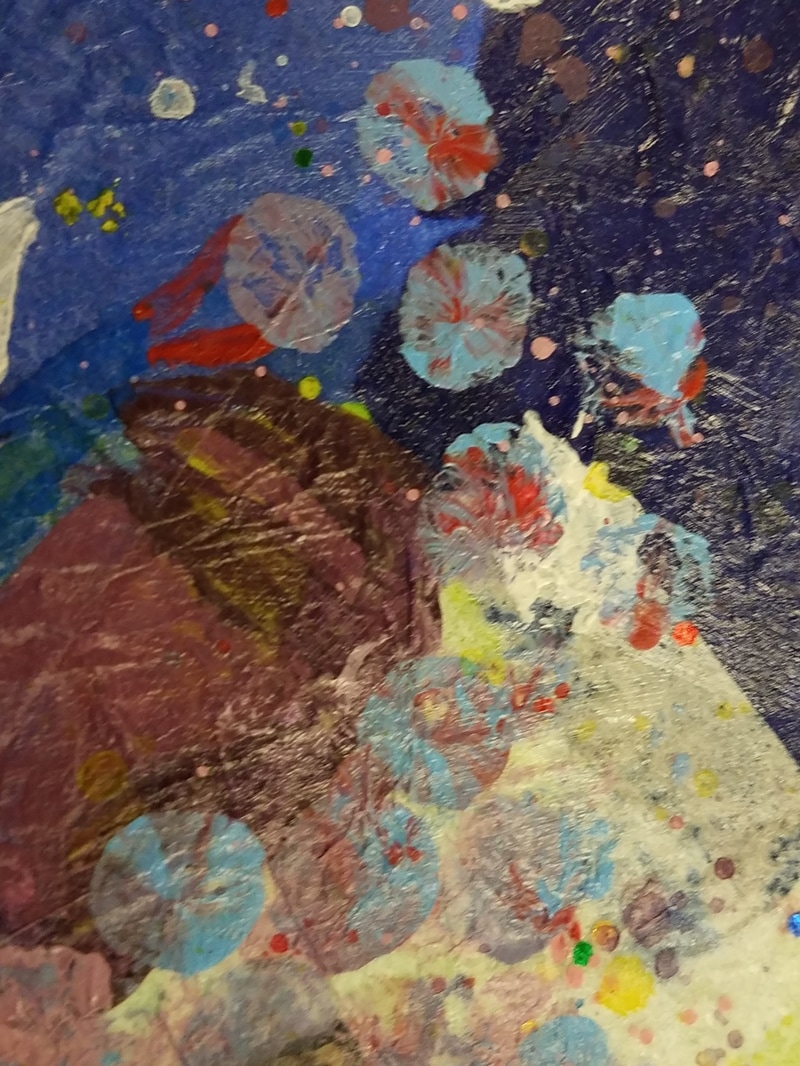
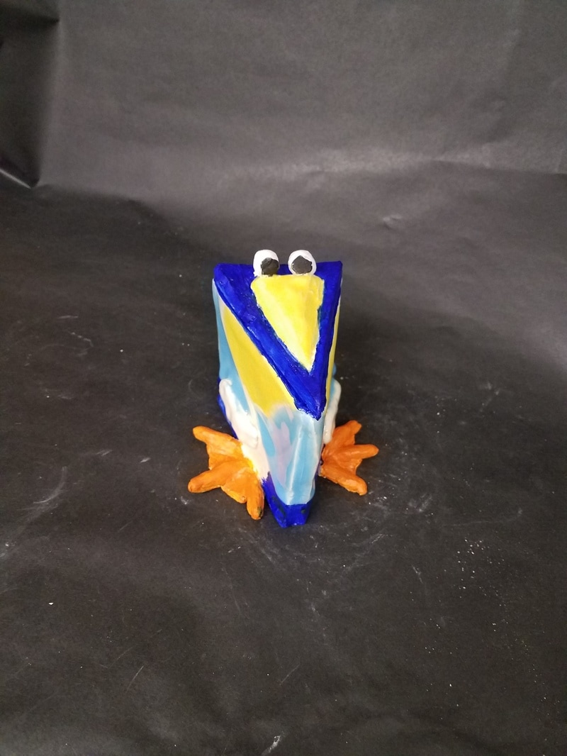
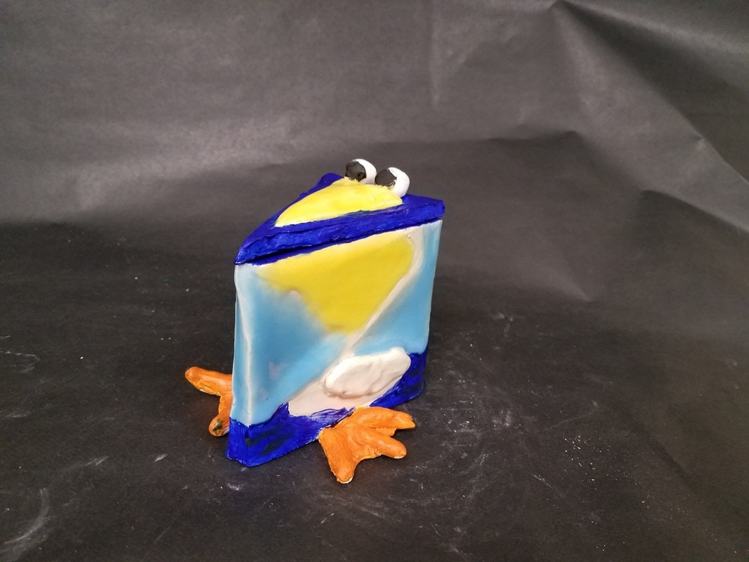
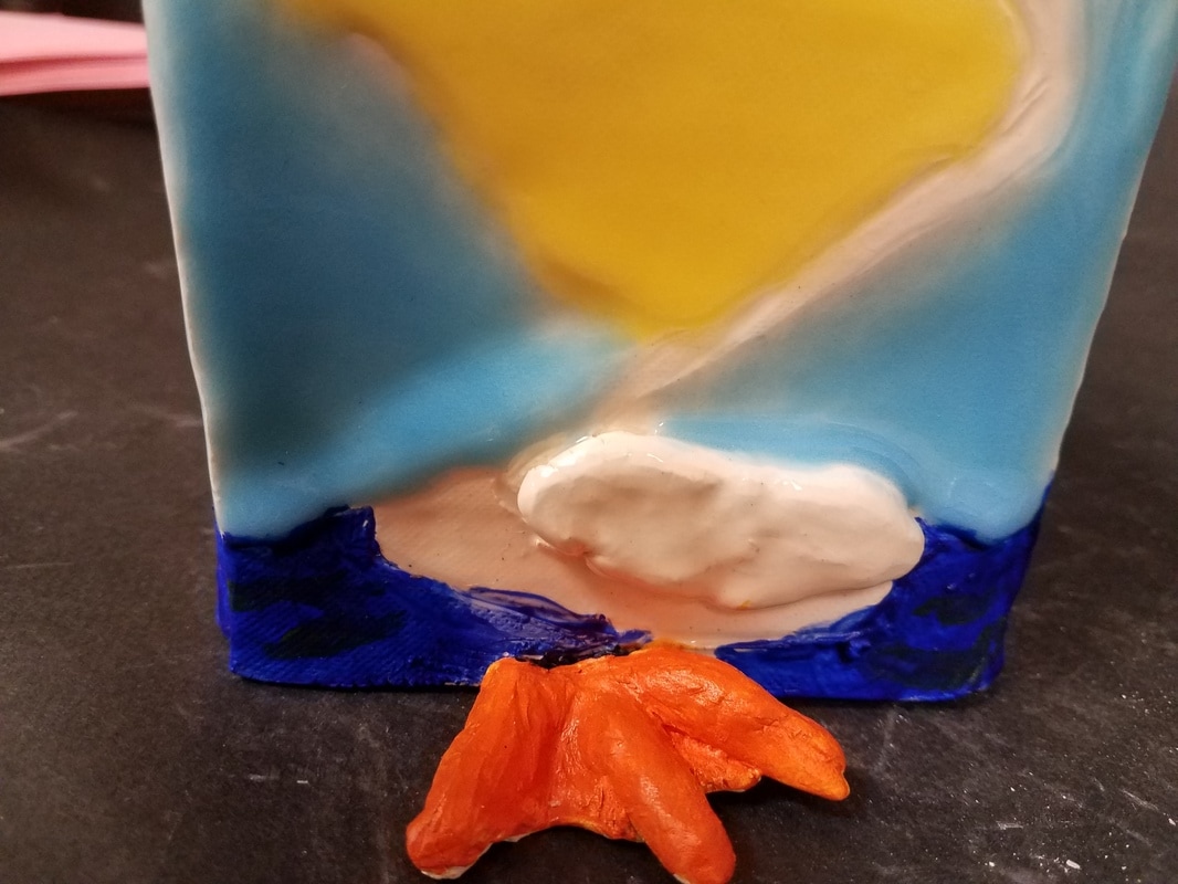
Since my in progress post about my sculpture I have finished glazing the outside of the piece. I used a light blue glaze to make it look like the sky, and I used clear glaze on the body so that it would look white. Then it was fired again, I then painted on dark blue to the bottom areas and inside of the piece to make it look like the pelican was sitting in the ocean. In my detail shot (bottom right picture) you can see little green lines, that is green paint I put on to look like seaweed, to give it more of an ocean look. Lastly I painted the glazeware's feet with orange paint.
I found the craving out of the pelican and adding the beak and eyes to be the most successful part (and my favorite) of the piece. I feel like it gave it character and a unique look to it. If I were to do it again I would make some of the pieces I attached to it thicker, so that it could have been scored on better then maybe it wouldn't fall of so much (in the end it stayed on).
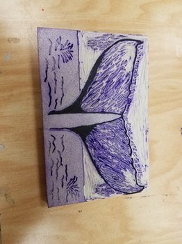
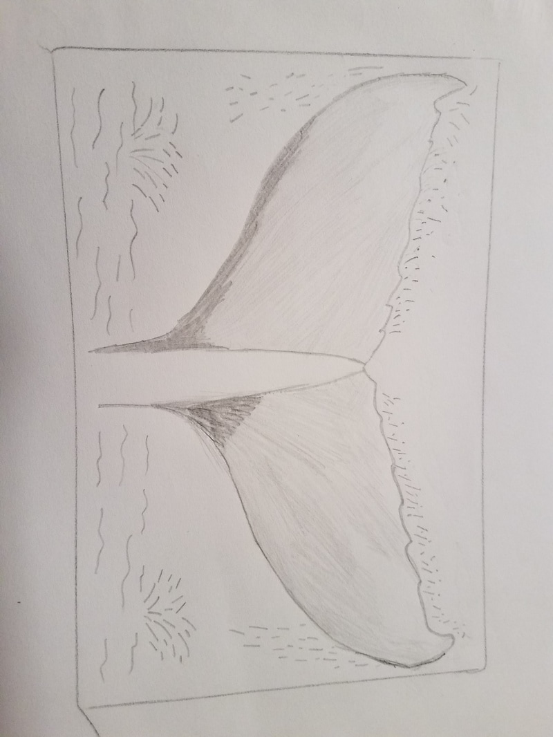
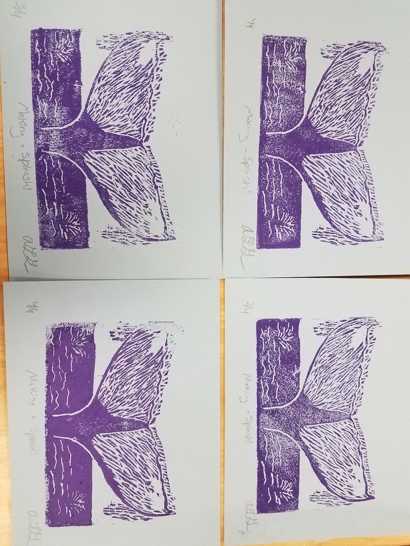
My piece shows off the theme of line by the values shown in the tail. Line is also shown in the water marks I made. They help to show how the water is falling and the splash zone.
My piece was successful in showing little details when printed. When printed the piece looks very natural and cool. If I were to do this again, I would fix the top splash lines; because they look too straight. I would also like to figure out something to do with the background to give it a little something more, I'm not sure what though. 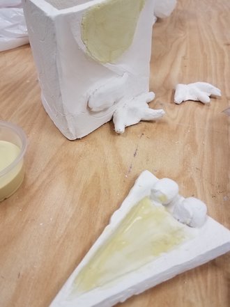 I plan on continuing to glaze my work. I will paint the background light blue, and the pelican clear. Once it is fired again, I will paint the water dark blue. After all that I will fix the feet on my piece and paint it yellow.
Something that I found difficult was attaching different parts of my piece together, such as limbs. The feet that I made kept falling off and now I have to reattach it later. Something successful that I did was craving out my piece. Craving it out makes it easy to see and paint. It gives the pelican character and I added to the lid to make it more realistic. I believe it really completes it and pulls the piece together. To create this piece I made three different temples and then used it to make slabs of clay. I then scratched and slipped the clay together on any part of it that touched another part. I then made wings, feet,, beak and craved out the pelican; this completed my greenware. Then once it was fired, I took the bisqued piece and started glazing it. 
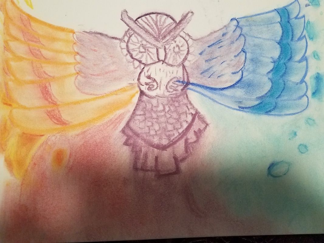
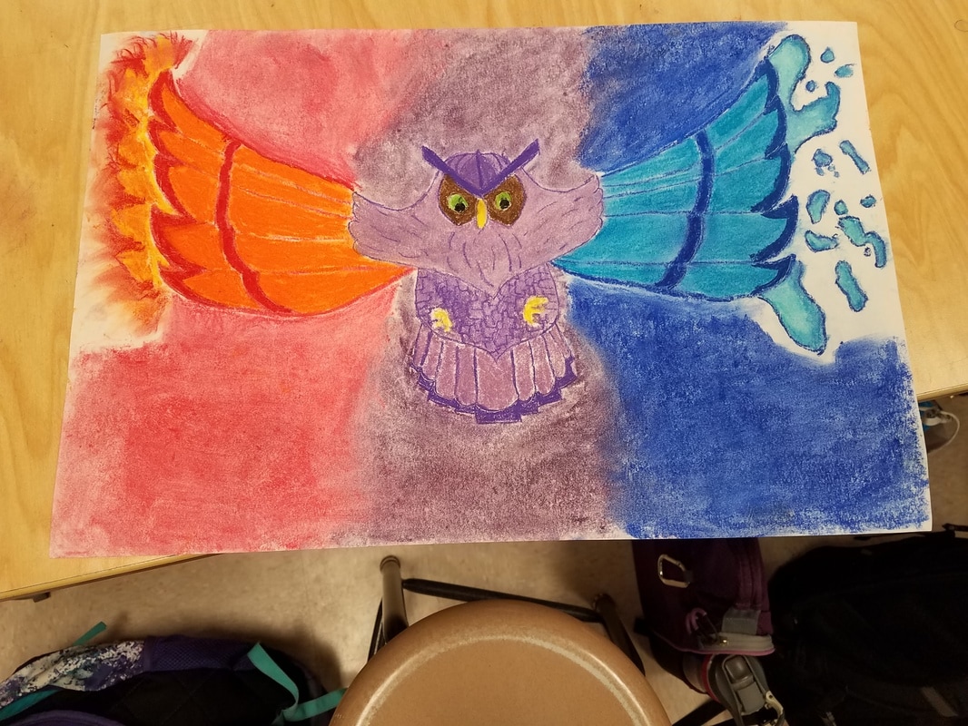
For my piece I chose chalk because I felt that it would make it easier to add in the different elements; mostly for the fire. I found the chalk made it easier to form the whips of the fire and to blend the different colors. I added fire and water to an owl. First since chalk cannot easily be erased I outlined the drawing in pencil, then I went over those lines in their base color. Next I colored the wings with a lighter color than the base color. I then added some details to the wings in their base color. After that I added the elements to the wing tips; for the fire I added the outline of it in yellow and red then went over it in orange to blend them. On the water side I outlined the base of the water and its droplets. I then added a slightly darker blue to the inner edge of the droplet, next I added a light blue to blend it. After all that all I had to do was add details to the center purple area and I was done. |
AuthorThis is my art blog for school. Archives
June 2017
Categories |


 RSS Feed
