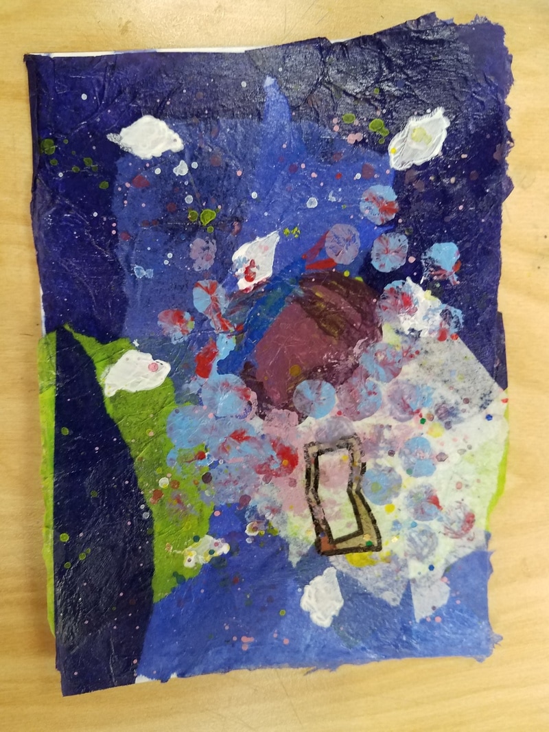
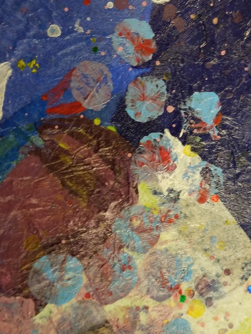
I used 5 layers, the first layer was paper mache, the second layer was diamond stencils I used white paint to contrast the dark background, the third was markers, I used that to draw the book, it had to be clear for people to tell what it was so I felt that marker was the best, then the fourth layer was paint, it was used to make the butterfly, I wanted to make it look like it was coming out of the book, the fifth layer was the bubble wrap. I put blue and red on the bubble wrap so that it would make a sort of tie-dye design and look to it.
My word was believe I portrayed it as an butterfly coming out of a book. It gives the impression that if you believe in something it can come to life.
0 Comments
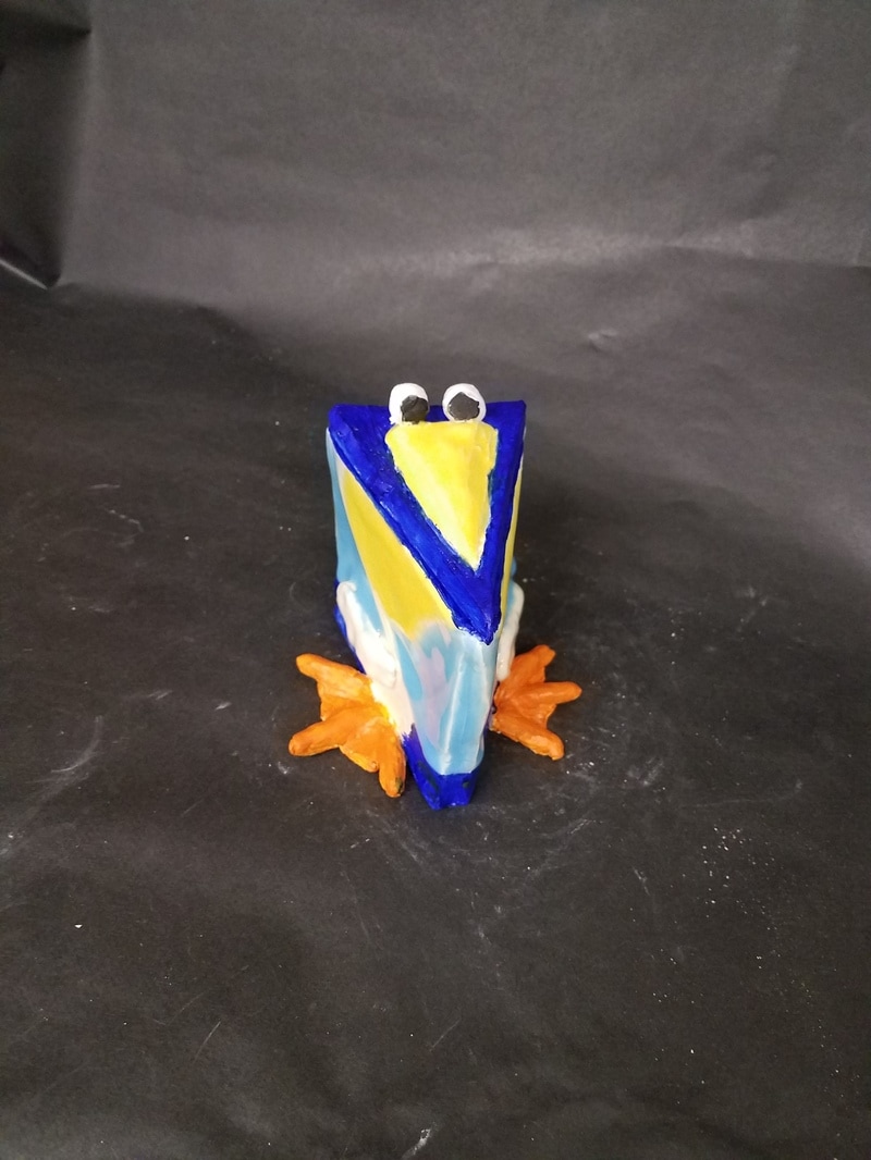
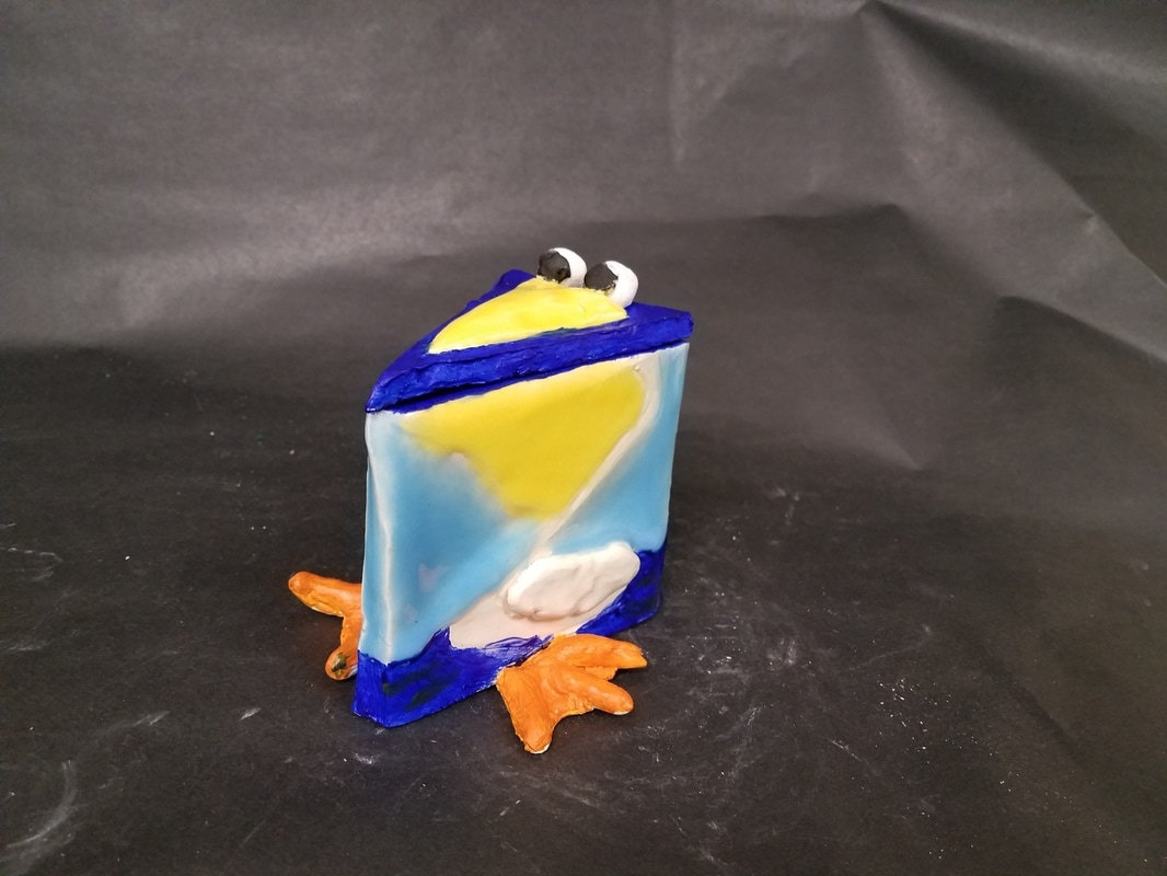
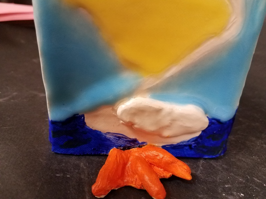
Since my in progress post about my sculpture I have finished glazing the outside of the piece. I used a light blue glaze to make it look like the sky, and I used clear glaze on the body so that it would look white. Then it was fired again, I then painted on dark blue to the bottom areas and inside of the piece to make it look like the pelican was sitting in the ocean. In my detail shot (bottom right picture) you can see little green lines, that is green paint I put on to look like seaweed, to give it more of an ocean look. Lastly I painted the glazeware's feet with orange paint.
I found the craving out of the pelican and adding the beak and eyes to be the most successful part (and my favorite) of the piece. I feel like it gave it character and a unique look to it. If I were to do it again I would make some of the pieces I attached to it thicker, so that it could have been scored on better then maybe it wouldn't fall of so much (in the end it stayed on). |
AuthorThis is my art blog for school. Archives
June 2017
Categories |
 RSS Feed
